FrutigerOS - Parody
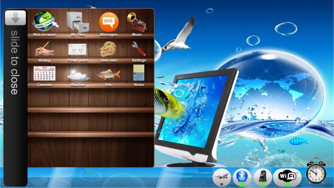
This is a user interface I designed in Microsoft PowerPoint to mock and parody the current Frutiger Aero trend. Frutiger Aero is a retroactive name given to skeumorphic designs from the late 2000s, more so ones such as Microsoft Vista. However this has been boiled down into a silly Tik Tok trend by people who are too young to have ever used Win 7 / iOS 6, and people bitching about how UI isn’t as good as it used to be MANNN. Very few software designers got “frutiger aero” or skeumorphism right such as Microsoft and Apple, people (as they always do…) put on their rose tinted glasses and forget just how ASS some UI from back in the day used to look…
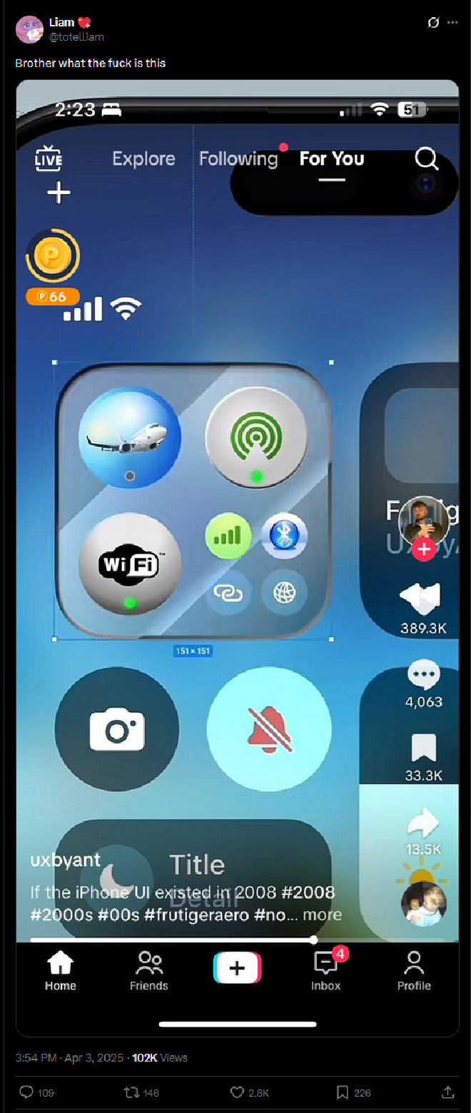
I based the user interface off of this Tweet showing an absolutely god awful skeumorphic UI. The use of shitty stock images for icons was absolutely hilarious so I stole that for this design.
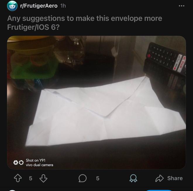
This image also embodies part of why I hate the frutiger aero trend.